The OpenStack map
In the ancient times (circa 2012), as OpenStack started to grow significantly, Ken Pepple created a diagram to represent the various OpenStack components and how information flowed between them. This diagram took a life of its own, being included in one version or another in every presentation to show in one spaghetti picture the complexity of OpenStack.
As we kept adding new (more or less optional) components to the mix, we stopped trying to represent everything in a single diagram, especially as the Technical Committee refused to special-case some components over others. That left us with a confusing list of 60+ project teams ranging from Nova to Winstackers, and no way to represent clearly "OpenStack".
This situation was identified as a key issue by the Board of Directors, the Technical Committee, the User Committee and the Foundation staff during a stategic workshop held last year in Boston. As a result, a group formed to define how to better communicate what OpenStack is, and a subgroup worked more specifically on a new map to represent OpenStack. Here is the result:
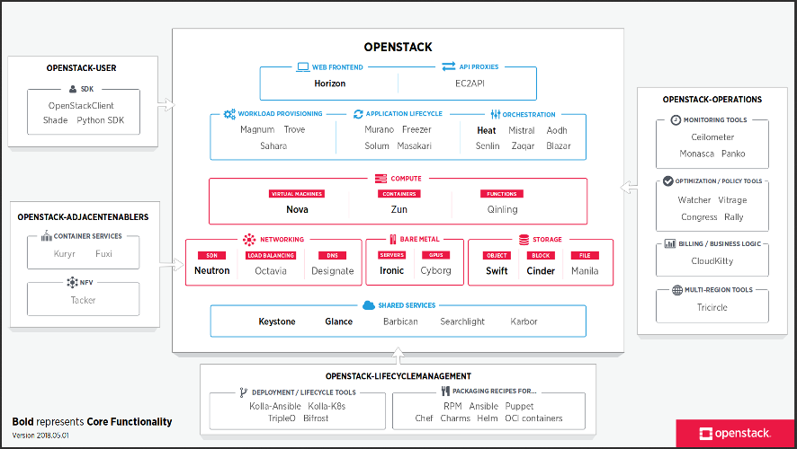
A number of things you should notice. First, the map is regularly updated. This is the latest version, from May, 2018. The map is also versioned, using a date-based number. So if someone copies it for their presentation and it gets cargo-culted into generations of presentations from there on, it should be pretty apparent that this may not be the latest available version.
Cartographers know that map design is more about what you leave out than about what you represent. This map is very opinionated in that respect. It is designed to be relevant to consumers of OpenStack technology. So it only represents first-order deliverables, things that someone may opt to install or use. That's the reason why it shows Nova, but not Oslo libraries: it does not represent second-order deliverables that first-order deliverables depend on. It also ignores plug-ins or drivers that run on a main deliverable (like Storlets running onto Swift, Dragonflow running onto Neutron, or magnum-ui running onto Horizon).
The remaining components are laid out in named "buckets", based on who the consumer is and what question they answer. There is the main OpenStack bucket, which contains components that provide a user-facing API, that you may deploy to extend the capabilities of your cloud deployment. On the right, the OpenStack-operations bucket contains add-on components that facilitate operating an OpenStack cloud. On the bottom, the OpenStack-lifecyclemanagement bucket shows the various solutions you can use to facilitate installation and lifecycle management of an OpenStack cloud. On the left, the OpenStack-user bucket contains tools that end users of OpenStack clouds can install to help interact with a running OpenStack cloud. And finally, the OpenStack-adjacentenablers bucket contains tools that help other technology stacks (Kubernetes, NFV...) make use of OpenStack services.
Inside each bucket, deliverables are approximately categorized based on what service they deliver. In addition to that, the main OpenStack bucket is organized in a semi-logical manner (base services at the bottom, higher-level services at the top). An opinionated set of "core functionality" is marked in bold to attract the attention of the casual observer to the most-consumed components.
There are lots of different ways to slice this cake, and a lot of things do not perfectly fit in the simplistic view that the map presents. The result is obviously very opinionated, so it cannot please everyone. That's why it's produced by the Foundation staff, with input from the Technical Committee, the User Committee and the Board of Directors. That doesn't mean its design cannot change, or be fixed over time to better represent the reality.
Working on this exercise really helped me visualize "OpenStack" as a product. You can see the main product (the OpenStack bucket), separate from operational add-ons, deployment tools, client tools and technology bridges. You can see things that do not fit well in the map, or stay at the edges of the map, that we could consider cutting out if they are not successful.
We hope that this map helps people to visually represent OpenStack and can replace the infamous spaghetti diagram in future slidedecks. The next step is to communicate that map more widely, and leverage it more heavily on web properties like the Project Navigator. You can always find the most recent version of the map at www.openstack.org/openstack-map.